Website design & development
Fix My Books.
Bookkeeping, made clear.
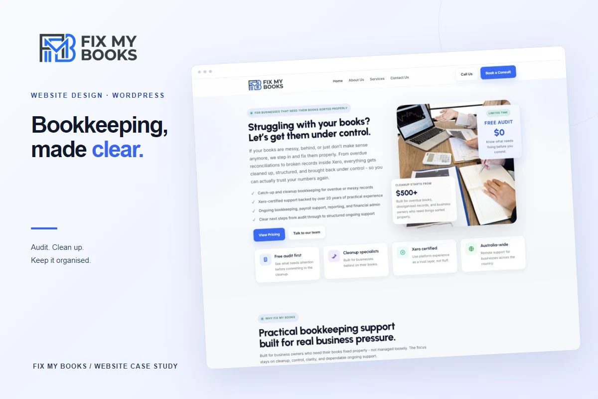
Website design and WordPress development for an Australian bookkeeping business. A clear service structure connects the free audit, cleanup and ongoing support, with a consistent visual language across desktop and mobile.
01 / The brief
Make a complicated problem
easier to approach.
Fix My Books provides remote bookkeeping support for Australian businesses with overdue, disorganised or unreliable records. The website needed to explain that offer in language a business owner could understand before getting into the detail.
The WordPress website introduces the business through a clear service structure and direct routes to further information and contact. Its content follows the customer’s needs: assess the records, address the backlog and maintain accurate books through ongoing support.
02 / The homepage
Clarity from
the first screen.
The homepage opens with the problem the visitor recognises: books that have fallen behind or stopped making sense. A direct headline, a blue and white palette and visible starting points introduce the service without requiring specialist knowledge.
Service summaries, an explanation of the process and frequently asked questions build out that first impression. The page gives visitors several ways to explore the offer at their own pace.

03 / Information architecture
Three services.
One connected journey.
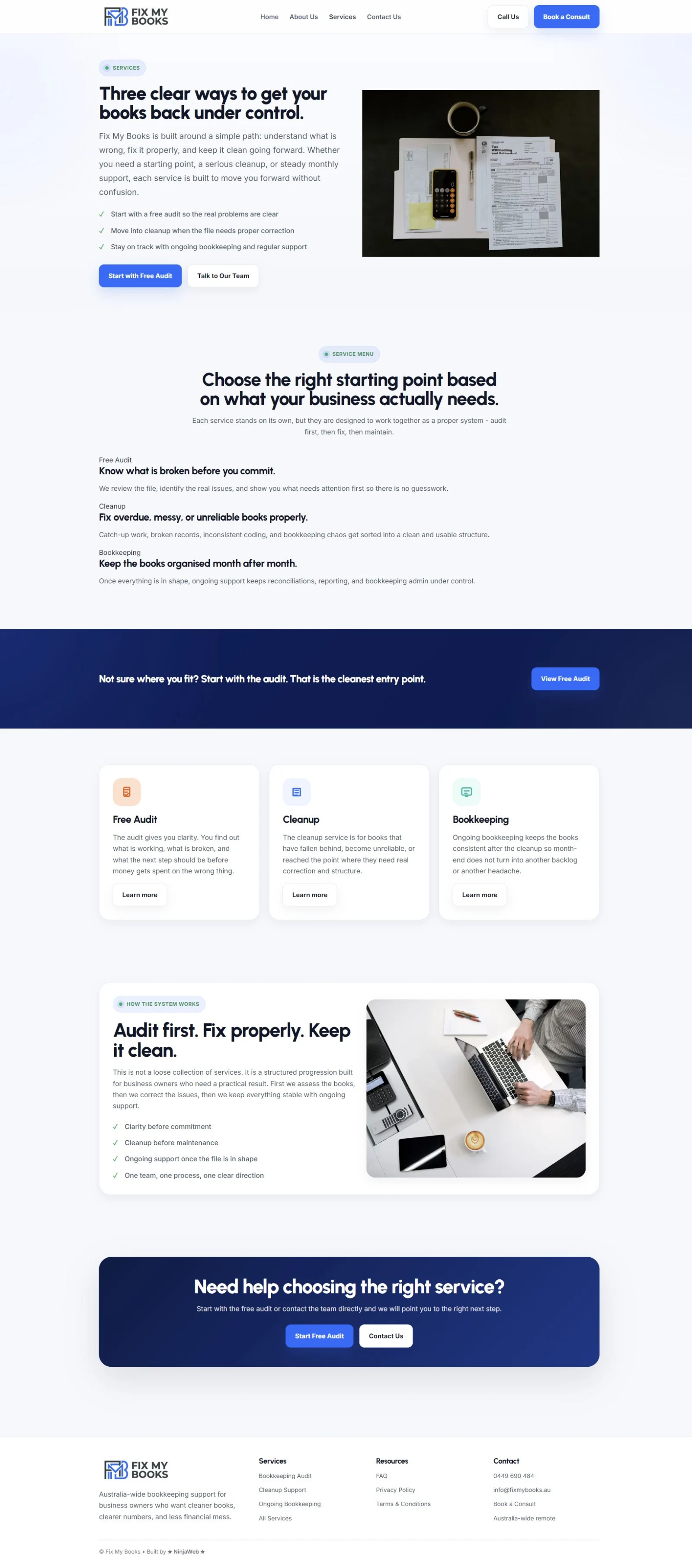
The service structure follows the condition of the customer’s books. An audit establishes what needs attention; cleanup addresses the backlog; ongoing bookkeeping maintains the file. Each stage has its own page, while the overview explains how they fit together.
Free audit
A defined starting point: review the file, identify the problems and explain what needs attention.
Cleanup
A dedicated service for overdue records, catch-up bookkeeping and correcting an unreliable file.
Bookkeeping
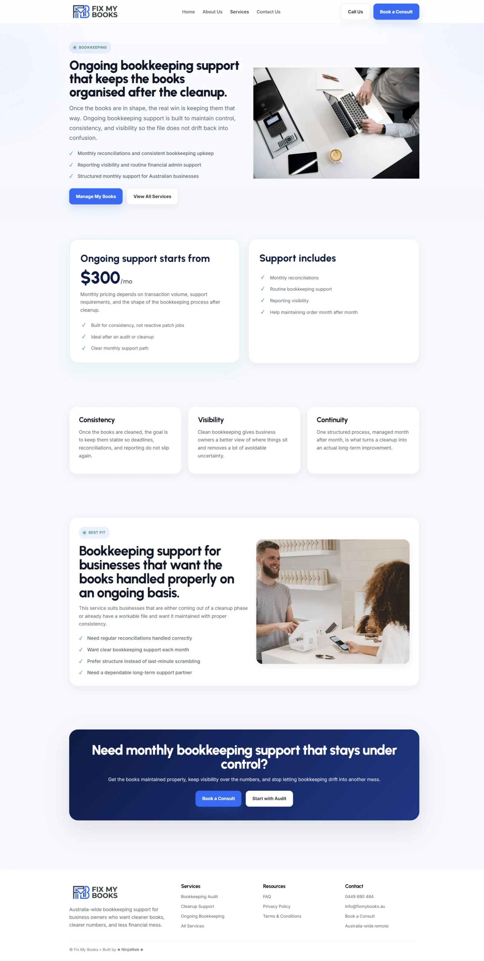
Ongoing reconciliations, reporting and routine support once the books are in a workable state.
04 / Service pages
Enough detail
to choose the next step.
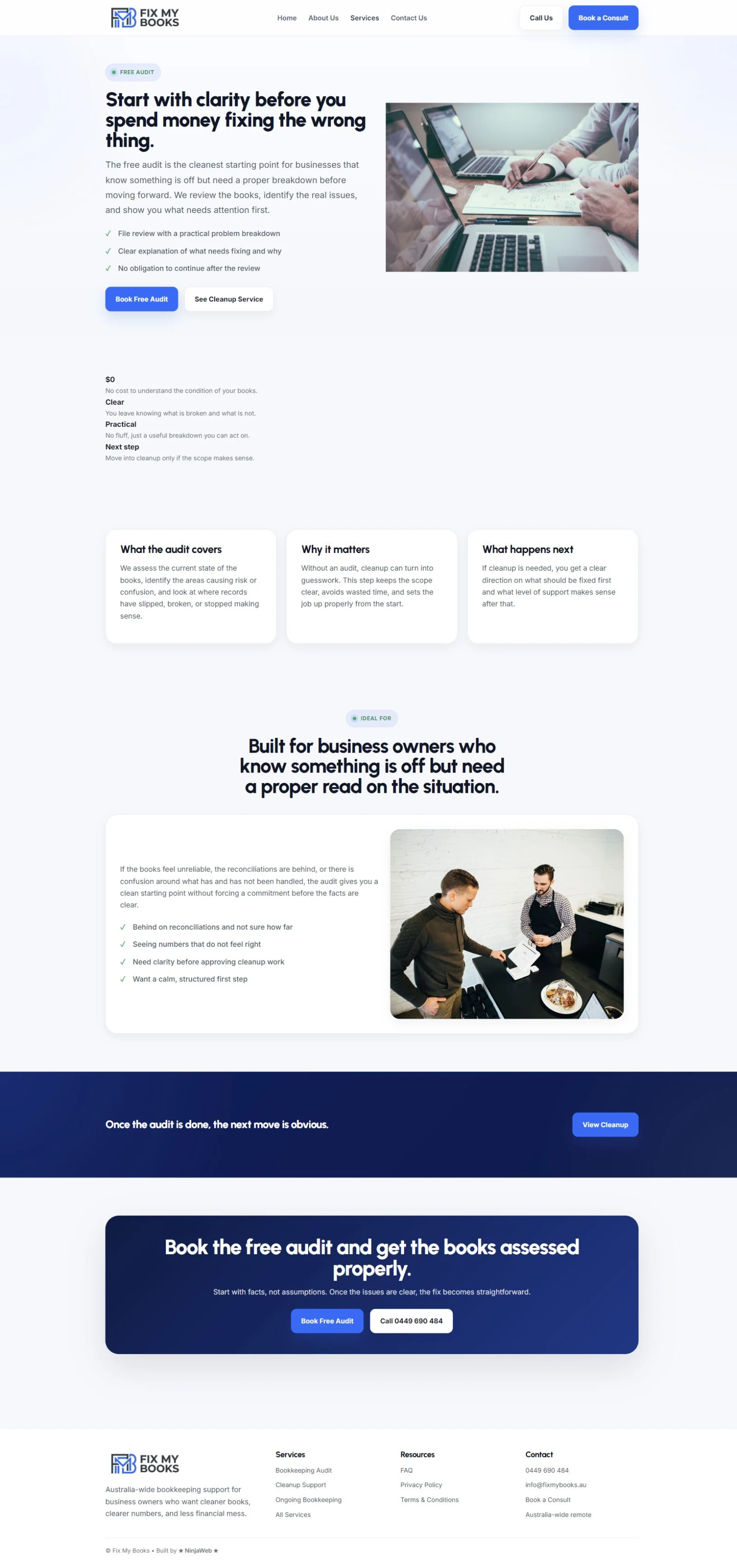
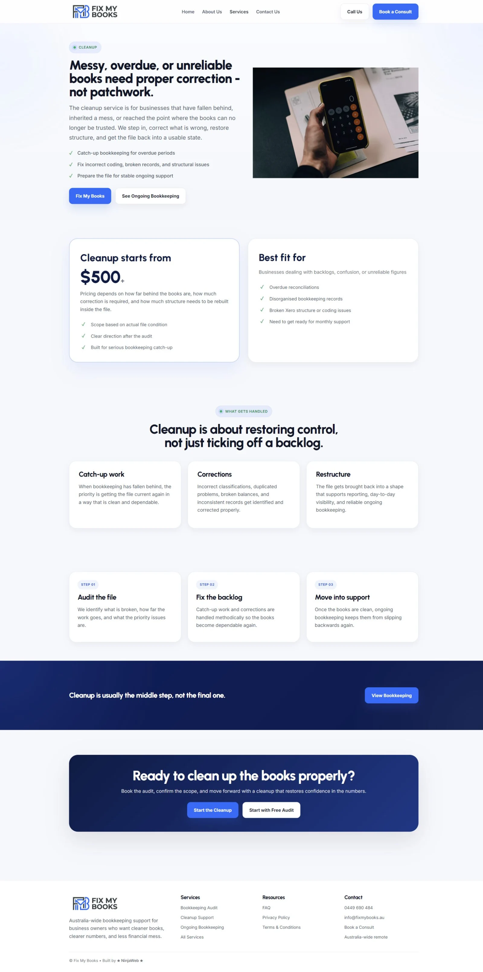
Each service page explains who it is for, what it covers and where to go next. A shared visual structure keeps the experience familiar, while the content gives each service a distinct purpose.
05 / Responsive layouts
The same priorities.
A smaller screen.
On a narrow screen, the layout becomes a single column and the contact buttons sit beneath the logo. Headings, service explanations and next-step links retain the same order, with space for the longer bookkeeping content to be read comfortably.


06 / Project scope
A consistent presence
for a practical business.
The website brings the business introduction and three core services together in WordPress. The emphasis is on understandable content, a recognisable visual system and a clear relationship between each page.
- Website design and WordPress development
- Homepage and business introduction
- Service overview and three service pages
- Responsive page layouts
- Consistent typography, colour and components
- Telephone, email and contact-page links