In-house brand
NinjaWeb — Identity, web & motion
An in-house brand identity developed across the NinjaWeb website, hosting services, software products and motion.
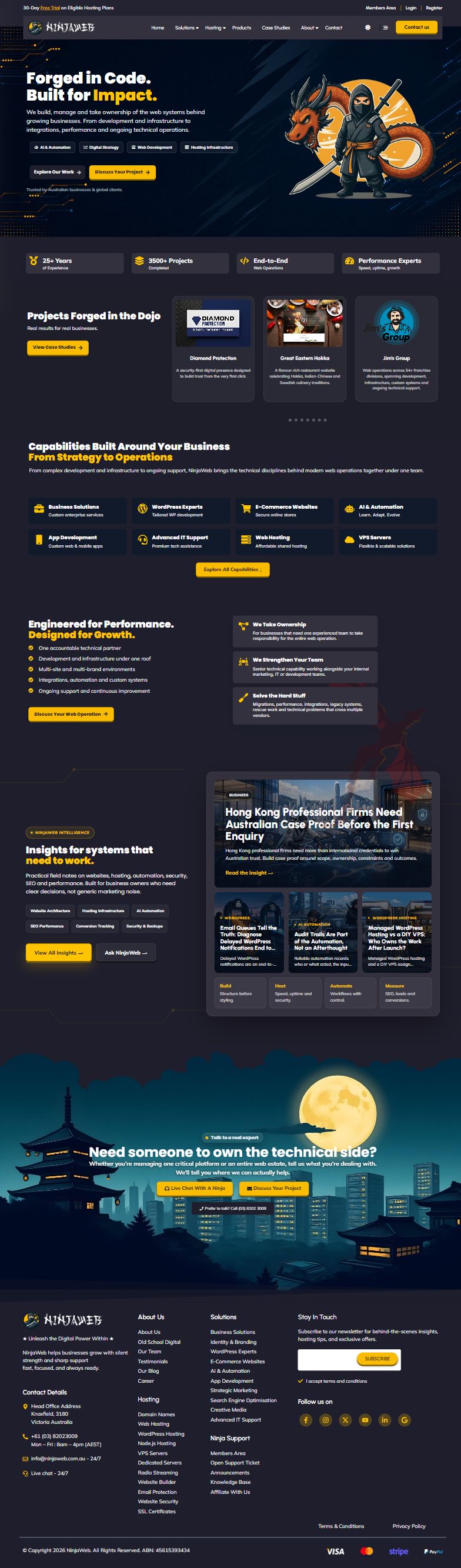
Visual identity
The brush-lettered wordmark gives NinjaWeb a recognisable signature. Gold marks key actions on navy, white and grey surfaces. The ninja and dragon carry the illustrative side of the brand.

Wordmark on a light surface

Wordmark on a dark surface
Colour, type and illustration
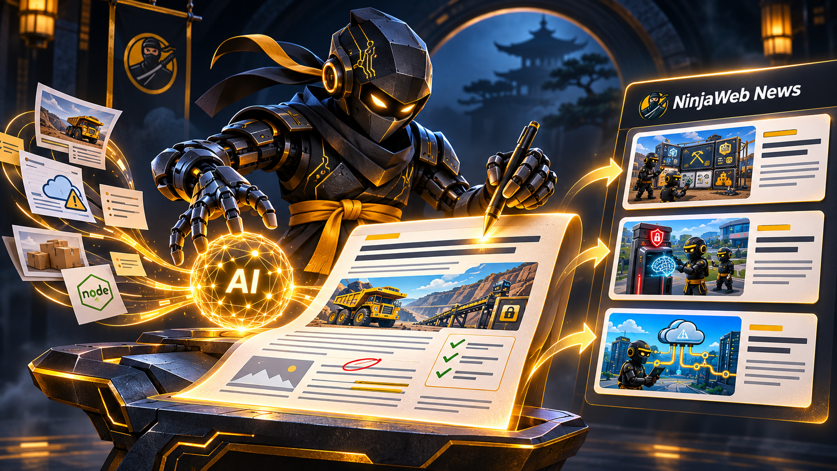
Urbanist and Mulish establish a consistent reading hierarchy across the website. The editorial illustration shows the NinjaWeb character turning source material into stories for NinjaWeb News.
Website & hosting
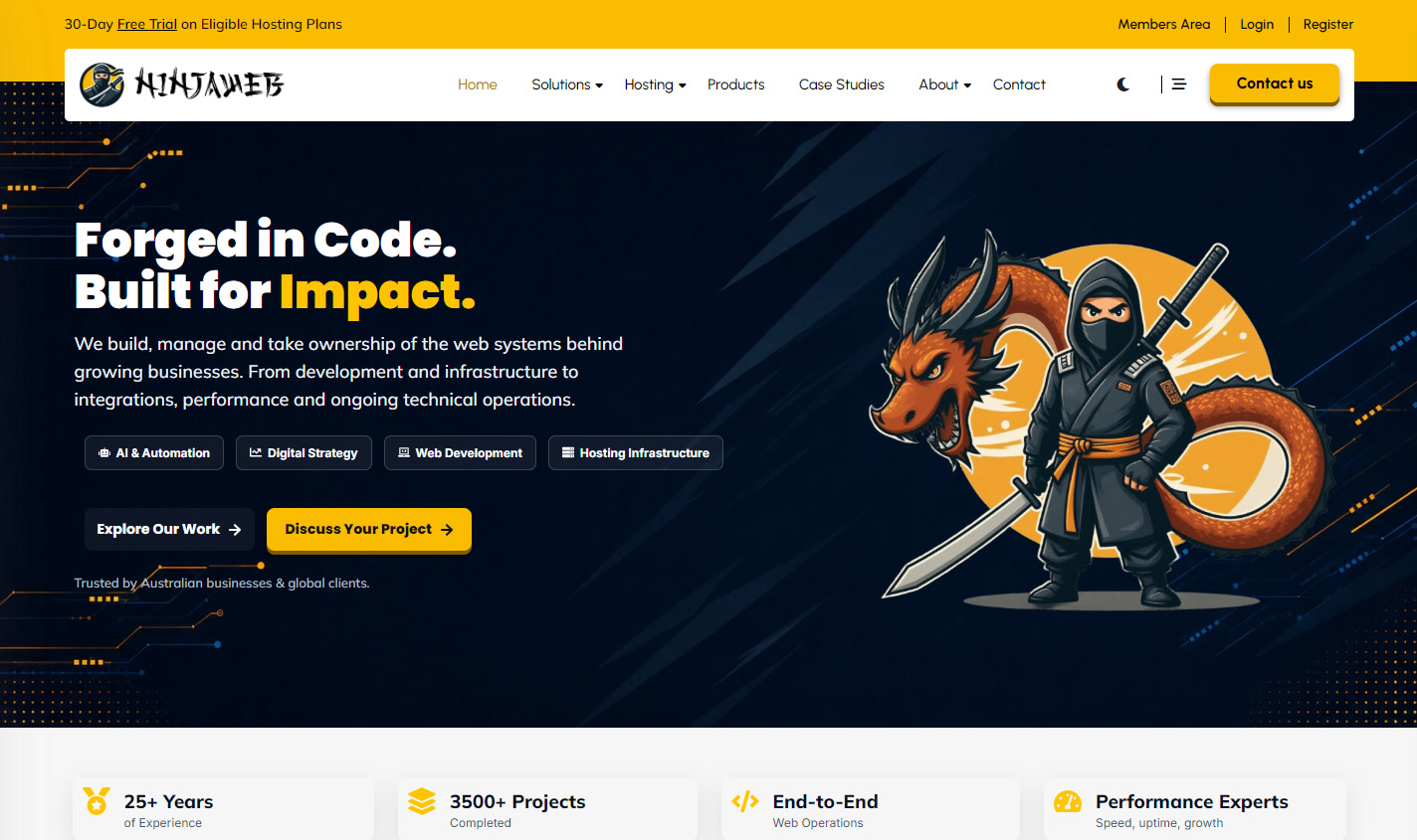
The homepage evolved as NinjaWeb added services and software. The desktop layout introduces the offer alongside the illustration. On mobile, the headline, service links and first action stack in reading order.


From service page to configuration
The VPS layout uses service-specific artwork and puts location, resources and plan comparison up front. The public site hands the chosen plan off to the WHMCS store.
Visit the VPS pageSoftware under the same identity
The product covers use different visual cues for cloud operations, search intelligence, editorial production and recovery. Each links to the project behind the artwork.
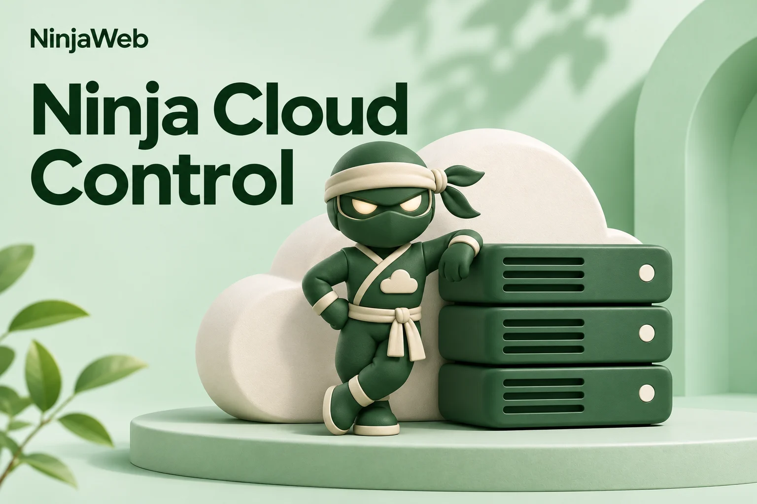
Ninja Cloud Control
Design and development of cloud-management tools connecting server provisioning, fleet operations and customer self-service.

GeoRanker
Design and development of a search-intelligence system connecting location pages, search data and prioritised SEO work.

Content Pilot
Design and development of an editorial system connecting ideas, AI-assisted drafts, images and SEO with review and publishing.
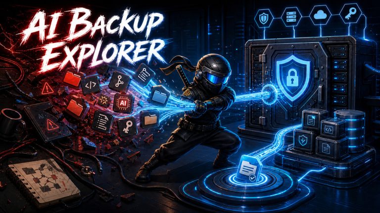
AI Backup Explorer
Product design and development of a workspace backup console, combining encrypted snapshots with file-level recovery.
Motion & selected work
The widescreen portfolio film uses the identity to introduce client projects. The vertical design reel carries the wordmark and gold accents into demonstrations of loading, error and offline states.